
Kishkindha: a concept real estate brand, from guidelines to a social media grid
Kishkindha is our own concept brand, built to show a complete real estate identity in one piece, from logo, colours and typography to stationery, site merchandise and an Instagram marketing grid.
The brief
Kishkindha is not a client. We invented the brand in house so we could show what a complete real estate identity looks like without waiting for a client to let us publish theirs. The brief we set ourselves was a premium developer brand that reads as trustworthy and architectural, holds together across print and digital, and carries one idea throughout, ancient architectural stability meeting modern luxury.
What we did
We designed the full branding system and documented it in brand guidelines: logo design, typography, colour palette, stationery, marketing grids, digital applications and the rules for using each.
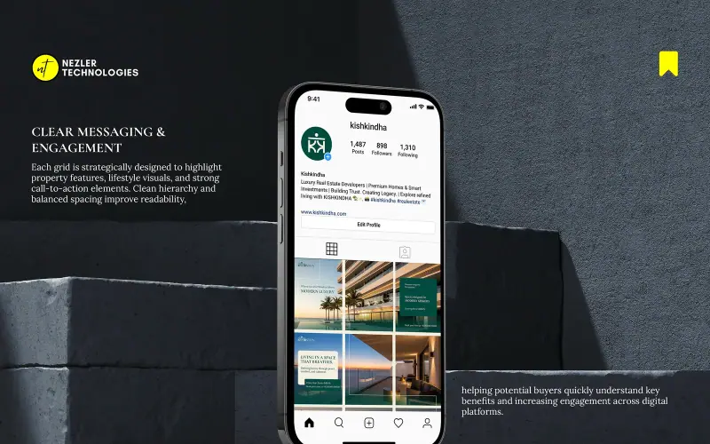
A separate marketing grid design built a cohesive, premium social media presence from the same system, with structured layouts, refined typography and a Deep Teal and Soft Cream palette. Each post highlights property features with a clear call to action.
Key features
- Brand foundations, including purpose, vision, mission, brand promise, positioning, target audience, core values and tone of voice
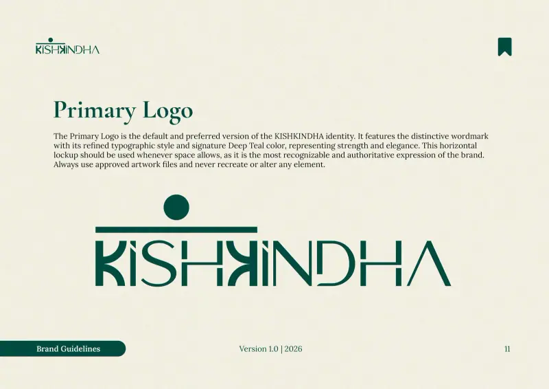
- Primary logo with structure, clear space, minimum size, background, monochrome, app icon and favicon rules
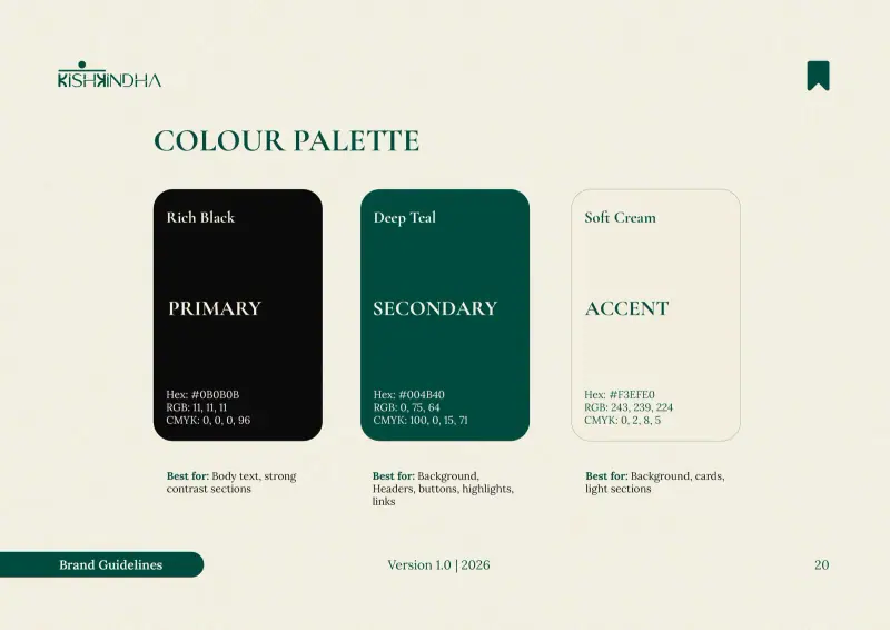
- Colour palette of Rich Black, Deep Teal and Soft Cream, with a stated use for each
- Typography system using Cormorant Garamond, Montserrat and Lora
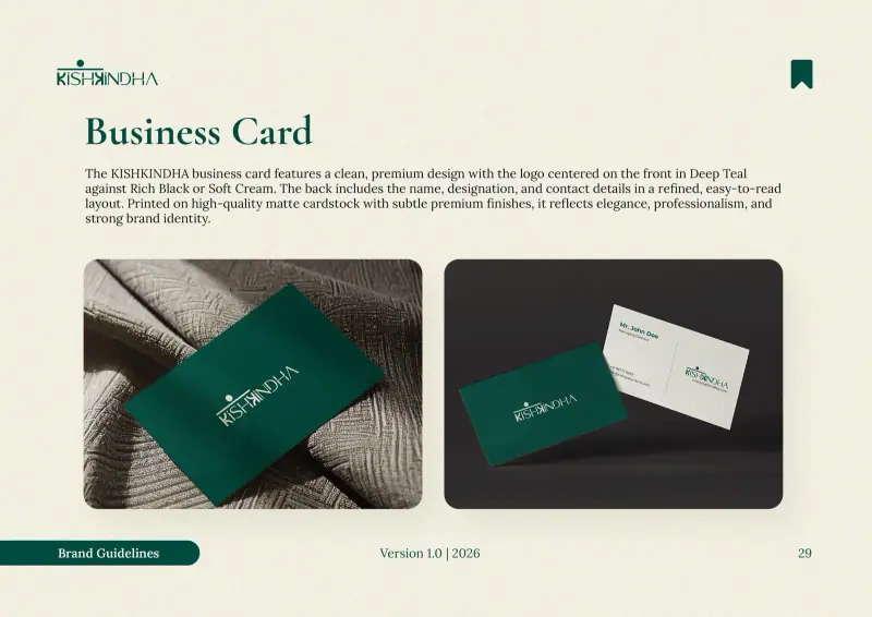
- Stationery and print, including business card, letterhead, ID card, note pad and pen
- Apparel and merchandise, including T-shirt, high visibility vest and hard hat
- Digital applications for the website and Facebook, Instagram, LinkedIn and X profiles
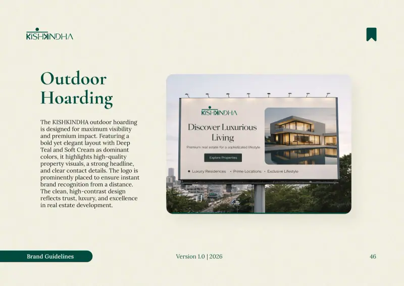
- Indoor and outdoor posters and an outdoor hoarding
- An Instagram marketing grid in two design concepts
Kishkindha is a concept project we created ourselves, not work for a paying client. Everything on this page was designed in house to demonstrate the method, and both pieces are published in full on Behance. We would rather show you a complete identity we are free to publish than a partial view of one we are not.
What the brand guidelines cover
The guidelines start with the thinking behind the brand before any design rules. The brand promise is "Strength that endures, Nature that nurtures." Three target audiences are defined: the heritage seeker, the eco-conscious family and first-time homebuyers. The tone of voice, called "The Sage Architect", is authoritative, wise and grounded.
The guidelines are organised in eight sections: brand overview, brand logo, colour palette, typography, stationery and print, apparel and merchandise, digital applications, and posters and banners.
Colours and type with a job to do
Each colour has a stated role. Rich Black, the primary colour, is for body text and strong contrast sections. Deep Teal, the secondary colour, is for backgrounds, headers, buttons, highlights and links. Soft Cream, the accent, is for backgrounds, cards and light sections.
Type works the same way. Cormorant Garamond, the primary typeface, is for headlines and key brand statements. Montserrat is the secondary sans-serif typeface, and Lora is used for body text and legal content, with a size hierarchy set for both print and digital.
A social media grid built from the same system
The marketing grid applies the guidelines to Instagram in two concepts. Posts pair architecture and lifestyle images with short headlines and a call to action, so the feed reads as one brand rather than a set of separate ads.
What a developer can take from this
Write the rules before the posts. When colour roles, type sizes and logo spacing are fixed in one document, every designer, printer and agency produces work that looks like the same brand.
Brand the site, not just the brochure. People also see a developer's brand at the project site and around the city. The guidelines extend to hard hats, high visibility vests, ID cards and hoardings, not only to social posts and the website.
Plan the feed as a grid. Anyone who opens the profile sees the posts together, not one at a time. Designing posts as a grid keeps the profile consistent as it grows.
Our branding service and social media marketing service cover this kind of work for real estate developers.
See the full projects on Behance: KISHKINDHA brand guidelines design and KISHKINDHA marketing grid design.
A closer look
Other projects

Motwani Lordsway Sanskruti
A cinematic launch microsite for a residential project on the sacred road to Puri, with Odia art direction and a Rath Yatra animated hero.
Vumee Amrapalli
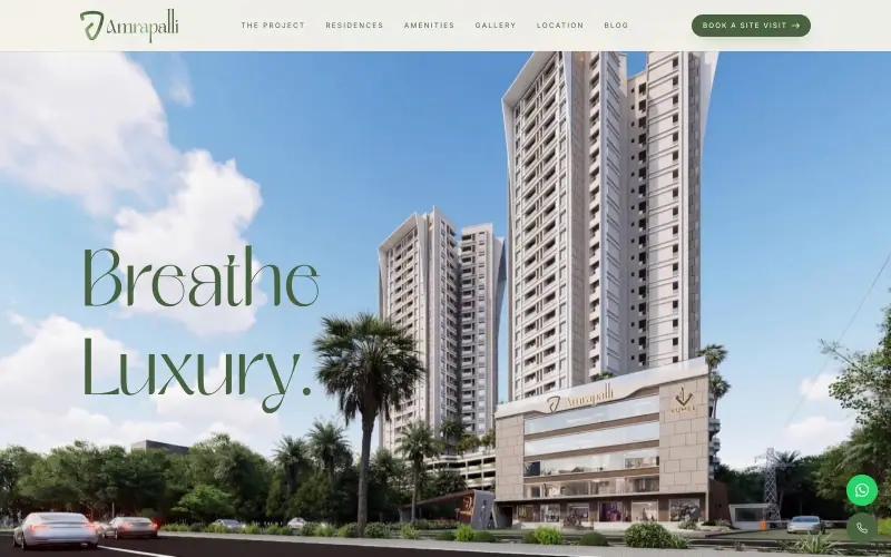
A launch microsite for luxury 2 to 3.5 BHK apartments in Patia, Bhubaneswar, built around a scroll-controlled tower reveal.
Want something like this?
Tell us what you are launching and when. We will reply with an approach, a timeline and a cost range.
Thank you. We have your details.
Someone from the team will reply within one working day.